Saturday, December 9, 2017

Lab 8: Spectral Signature Analysis and Resource Monitoring

Goals and Background

  Remote sensing can be used the monitor and interpret the spectral reflectance of earth's surface features across different bands of the electromagnetic spectrum. This is done through the creation of spectral signatures. In this lab 12 spectral signatures will be created for the the following features:
        1. Standing Water
        2. Moving Water
        3. Deciduous Forest
        4. Evergreen Forest
        5. Riparian Vegetation
        6. Crops
        7. Dry Soil (Uncultivated)
        8. Moist Soil (Uncultivated)
        9. Rock
        10. Asphalt Highway
        11. Airport Runway
        12. Concrete Surface
    Remote sensing can also be used to monitor the health of vegetation and soils. This will be done by calculating the NDVI index, and the ferrous soils ratio for Eau Claire and Chippewa counties and then creating a map of the results.


Methods


Part 1: Analyzing Spectral Signatures

This part consisted of creating the 12 spectral signatures in Erdas. There are a few steps in creating a spectral signature for a given feature. First, one must load the image which the user wants to derive the spectral signiture from. In this lab, its a ETM ++ image of Eau Claire and Chippewa counties in Wisconsin. Then, one navigates to Drawing → Polygon, and draws and AOI for the region which the spectral signature will be created. To help identify the 12 features, the image view was linked to Google Earth, which can be done in the Google Earth tab. After creating the AOI for the feature, one then activates the Raster tab and then navigates to Supervised → Signature Editor → Create new Signature from AOI. Figure 5.0 shows the AOI for the Moving Water feature.
Fig 5.0: AOI for Moving Water
  Most of the AOIs created were fairly small because many of the features didn't cover a very large area. After the 12 signatures were created, some analysis was done on them to see how similar and different features are in terms of the reflectivness of electromagnetic energy across different wavelengths. Figure 5.1 shows what the Signature Window looked like after all twelve signatures were collected.
Fig 5.1: Signature Window

Part 2: Monitoring Vegetation and Soil Health

  This part consisted of using the Indicies tool to calculate NDVI and Ferrous Soils ratio for the two counties. NDVI is calculated by using the equation: NDVI = (NIR - Red) / (NIR + Red). NIR and Red refer to their respective spectral bands in the ETM++ image. The Ferrous Soils ratio is calculated using the equation: Ferrous Mineral = (MIR) / (NIR). Once again, MIR and NIR refer to their respective spectral bands in the ETM++ image. Neither of these were calculated manually, to get the results quick for the entire image, the Indicies tool was used. The Indicies tool and its parameters, input, and output can be seen below in figure 2.1.
Fig 5.2: Calculating the NDVI Index


  Then the Indicies tool was used again, but this time, the ferrous soils index was chosen. This can be seen below in figure 5.3. After the two output images were created, they were brought into ArcMap, and maps were created to help interpret the data.
Fig 5.3: Calculating the Ferrous Mineral Ratio

Results

  Figure 5.4 below on the right shows the standing water signature while figure 5.5 shows the moving water signature. For all of the signatures, layer one is band one, layer two is band two, layer three is band three, layer four is band four, layer five is band five, and layer six is band seven in the ETM++ image. The standing water and moving water have very similar spectral signatures, the main difference occurs in band 4 where moving water has greater reflectance.

Fig 5.4: Standing Water Spectral Signature
Fig 5.5: Moving Water Spectral Signature

  Figure 5.6 shows the spectral signature for a deciduous forest while figure 5.7 shows the spectral signature for an evergreen forest. The spectral signatures for the deciduous forest and for the evergreen forests are similar as well. The main difference is that overall the deciduous forest has a higher reflectance. This is because deciduous forests usually contain more vegetation and leaves can reflect electromagnetic energy more than pine needles can.

Figure 5.6: Deciduous Forest Spectral Signature
Figure 5.7: Evergreen Forest Spectral Signature
  Figure 5.8 shows the spectral signature for riparian vegetation, and figure 5.9 is a spectral signature for crops. The main difference between these signatures is that crops overall reflect much more than riparian vegetation. This is because crops are constantly being irrigated and therefore are healthy, where as riparian vegetation occurs along stream edges and the farther away the riparian vegetation extends from the stream, the less healthy it will be.

Fig 5.8: Crops Spectral Signature
Fig 5.9: Riparian Vegetation Spectral Signature
  Figure 5.10 shows the spectral signature for dry soil, and figure 5.11 shows the spectral signature for moist soil. There is one main difference between the dry soils and moist soils spectral signature. This difference occurs in bands 4, 5, and 6. The dry soil reflects more in these bands while the moist soil reflects less.
Fig 5.10: Dry Soil Spectral Signature

Fig 5.11: Moist Soil Spectral Signature
  Figure 5.12 is the spectral signature for rock, and figure 5.13 is the spectral signature for an asphalt highway. Surprisingly, there are very little similarities between the rock and asphalt highway spectral signatures. Overall, the rock reflects much less. This is perhaps because the rock chosen for this spectral signature was located at big falls on the Eau Claire River where perhaps water was included in the AOI which then contaminated the rock spectral signature.
Fig 5.12: Rock Spectral Signature
Fig 5.13: Asphalt Highway Spectral Signature

  Figure 5.14 is a spectral signature for an airport runway, and figure 5.15 is a spectral signature for a concrete surface. In both signatures, the maximum reflectance can be seen in band 5. However, the lowest reflectance for the airport runway occurs in band 4 while the lowest reflectance for the concrete surface occurs in band 7.
Fig 5.13: Airport Runway Spectral Signature
Fig 5.14: Airport Runway Spectral Signature
Fig 5.15: Concrete Spectral Signature
  Figure 5.16 is what the spectral signature looks like for all the features when they are plotted on the same graph. The band that sticks out the most is band 4. For features which contain chlorophyll, their spectral reflectance increases in this band, for features which don't contain chlorophyll, their spectral reflectance decreases in this band.
Fig 5.16: All of the Spectral Signatures Plotted Together

  Figure 5.17 is a map of the NDVI index. Much of the county as a high vegetation index. This is because, there is more farmland in the eastern portions of these counties. Also, there is more forest in the eastern portion as well. The areas where this is no vegetation in the western portion of the counties is where there are fallow crop fields.
Fig 5.17: NDVI Index Map

  Figure 5.18 is a map of the ferrous soils ratio. Looking at the ferrous minerals map, most of the ferrous minerals are primarily located in the western portion of Eau Claire and Chippewa counties. Ferrous minerals are generally less present in the eastern portion of the map. There is a fine boundary that runs northwest to southeast in the map. To the west of this boundary, ferrous minerals are present, and to the east of this boundary, ferrous minerals are low or absent. another spatial pattern is tat many of the ferrous minerals are concentrated near the Chippewa River.
Fig 5.18: Ferrous Minerals Map


Sources

United States Geological Survey, Earth Resources Observation and Science Center. ETM++ Satellite image

Tuesday, December 5, 2017

Lab 7: Photogrammetry

Goals and Background:
   This lab introduces photogrammetric operations of aerial photographs and satellite imagery. The lab consists of three parts. Part one deals with calculating scales, area measurements, and relief displacement from an aerial photo. Part 2 details the creation of anaglyph images with the use of a DSM and a DEM. Part 3 consists of orthorectifying a photo and performing triangulation on it.

Methods

Part 1: Calculating Scales, Area Measurements, and Relief Displacement

Scale
  This first section consisted of calculating the scale for an aerial photograph of Eau Claire. The ground distance between two different points on the map was given to be 8822.47 ft. Then, the distance on the map (2.6875 in) was measured on the map between the two points. To calculate the scale, the  equation Scale = (photo distance) / (real world distance) was used. The real world distance was converted to inches and then the variables were inserted into the equation: Scale =2.6875 in / 105,869.64 in. Then the equation was simplified Scale =1 in / 39,393.3544 in. The last step before getting the scale is to drop the units and round the scale to the nearest hundred. Then, the scale of a second image was calculated. This time, the focal length, and the height of the camera was given. This scale was determined following a similar simplification processes as before, but this time the equation used was Scale = (focal length of camera lens) / (flying height of aircraft above surface). The elevation of Eau Claire (796 ft) was used to determine the flying height of the aircraft above the surface. The focal length was given as 152 mm. The altitude of the aircraft was 20,000 ft above sea level when the photo was taken. Plugging this into the equation: Scale = (152 mm) / (20,000 ft - 796 ft). This is simplified to then: Scale = 152 mm / 5,853,379.07 mm and then to Scale = 1 mm / 38,509.07 mm.  Both of these scales were then simplified to ratio scales and rounded to the nearest hundred.

Area
  The area and perimeter of a gravel pit / lagoon was measured in Erdas using the Measure Perimeters and Areas tool. This tools was used to digitize the lagoon / gravel pit, so that the area and perimeter could be calculated. The area was measured in ha and acres, and the perimeter was calculated in meters and miles.

Relief Displacement
  Next, relief was calculated for a smoke stack at the heating plant near the upper campus of UW-Eau Claire. The scale of the photograph was given (1:3,209) along with the height of the aerial camera above the local datum (3,980 ft). The equation used to calculate the relief is Relief Displacement = [( photo radial distance of top of the displaced object from principal point)*(height of object in real life)] / (height of camera above local datum). To find the height of the object, the object was measured in the photograph and the map scale was accounted for. The height of the object in the photo was measured to be .375 in, which means that the real world height of the object is 1,203.375 in. The radial distance from the top of the smoke stack was 9.25 in. These variables were then plugged into the equation as such:  Relief Displacement = [(9.25 in)*(1,203.375in)] / (47,760 in). This equation was then simplified and solved. The calculated relief displacement for the smoke stack was then used to determine what kind of adjustment should be made to the smoke stack in relation to the principal point.

Part 2: Anaglyph Images

  Two anaglyph images were created in this part of the lab. One was created using a DEM as the input DEM and another was created using a DSM as the input DEM. To create the images, the Anaglyph Generation tool was used. This can be seen below in figure 4.0 for the anaglyph image for which the DEM was used as the input image. The anaglyph image created using the DSM was done using the same tool, but this time instead of inputting the DEM as the input DEM, a DSM was used. The outputs of these tools was made sure to be saved in the Lab7 data output folder.
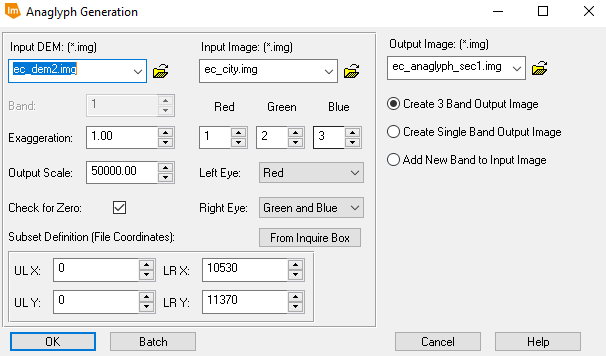
Fig 4.0: Anaglyph Generation Tool used with a DEM as the input

Part 3: Orthorecification

  This part of the lab consists of orthorectifiying two SPOT images in palm beach California using Lecia Photogrammetric Suite (LPS) in Erdas Imagine. This will be done by orthorectifying one distorted image to two different images which are already orthorectified. This processes consists of multiple parts:
    1. Create a New Project and Select a Horizontal Reference Source
    2. Collect GCPs
    3. Generate Automatic Tie Point Collection
    4. Triangulate the Images
    5. Orthorectify the Images

1. Create a New LPS Project
  This was done by navigating to Toolbox → Imagine Photogrammetry and creating a a new block file using the Polynomial-based Pushbroom geometric model category. Then, the projection UTM Clarke 1866 Nad27 (CONUS) UTM Zone 11 North was set.

2. Collect GCPs
  To do this, the first SPOT image was brought into the block file. Then, the reference information was verified. This changed the status of the the bar showing the readiness of the image for orthorectifying as shown below in figure 4.1.
Fig 4.1 Status bar
Fig 4.1 Status bar
  Then the Start Point Measuremet Tool was clicked which brought up the Point Measurement window. Then, the orthorectified image was brought in to insert the GCPs. Then, the radio button Reference Image Layer was clicked to show the distorted image in the right viewer and the orthorectified reference image in the left viewer. This can be seen below in figure 4.2
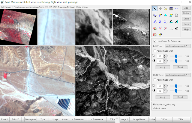
Fig 4.2: Point Measurement Tool Window Before Adding GCPs
  Next, the horizontal values of the 9 GCPs were entered for the first distorted image. The location of the first three GCPs can be seen below in figure 4.3.
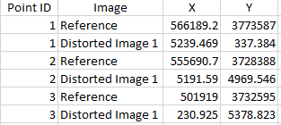
Fig 4.3: First 3 GCP Placement
 After that, a new reference image was used to collect the last two GCPs. In total, 11 GCPs were tied to the distorted image.
  Next, the vertical values of these GCPs were calculated. This was done by using the Reset Vertial Reference Source icon. Then a DEM was inserted in the DEM drop-down list from the authors University's folder. After the DEM is brought in, the z values are calculated by clicking on the
Update Z Values on Selected Points. Now, the GCPs must be collected for the second image. This was done by adding a new frame in the Photogrammetry Project Manager. Then, the GCP coordinates were entered using a process similar to that for the first inputting the GCPs in the first image. The same GCPs in the first distorted image were used in the second distorted image when possible.

3. Generate Automatic Tie Point Collection
  Tie point collection is performed on the overlapping areas of the two distorted images. Tie points were created by first clicking on the Sutomatic Tie Point Generation Properties icon in the Point Measurement Window. Then, some properties were changed in the pop-up dialog box and the tie points were generated by clicking on Run. An important property altered was the intended number of points/ image field. This was changed to 40. After the tie points were created, the accuracy of them were checked by clicking on a reference cell in the list of GCPs and making sure that the point location was identical in both images.

4. Triangulate the Images
  To do this, the Edit - Triangulation Properties button was clicked on. This opened up the triangulation dialog. In this dialog, some properties were altered, including setting the Itereation with Relaxation value to 3, changing the type of ground point type to Same weighted values, and changing the X, Y, and Z number field values to 15. These were changed because the spatial resolution of the main reference image is 20 meters. Using the value of 15 makes sure that the accuracy of the GCPs is about 15 meters. Then, the Run button was clicked on to run the triangulation. After this ran, a Triangulation Summary was opened from which a report was created as a .txt file by clicking on the Report button. After the triangulation, the status of the status bar changed as seen below in figure 4.4.
Fig 4.4: Status of Status Bar After Triangulation
5. Orthorectify the Images
  This was done by clicking on the Start Ortho Resampling Process icon which opened an Ortho Resampling window. In this window, the DEM was inserted into the DTM source, and the output cell size was changed to 10 for both X and Y. Also, the resampling method was changed to Bilinear Interpolation. Then, the second image to be orthorectified was brought in through the Add Single Output window by clicking on the Add button. Then, the Orthorectification was finally ready be run. This was done by clicking on the OK button. After this is done, the status bar looked like it does below in figure 4.5.
Fig 4.5: Status Bar After Orthorectification

Results


Part 1: Calculating Scales, Area Measurements, and Relief Displacement
  The scale of the first image is 1 : 39,400. Although technically calculated to be 1 : 39,393.3544 using the equation, scales are usually rounded to the nearest hundred scale degree. This is because the elevation of the features used causes there to be slight margin of error. A scale of 1 : 39,400 means that one unit on the map is 39,400 of those units in the real world. An example is a distance of 1 cm on the map is 39,400 cm in the real world.
  The scale of the second image is 1: 38,500. Although technically calculated to be 1 : 38,509.07, once again the scale was rounded because of possible error. This scale means that the image used to calculate the first scale has a smaller scale than the image which was used to calculate the second scale.
  The area of the lagoon is 37.8091 ha or 93.4283 acres. The perimeter of the lagoon is 4,109.87 meters or 2.553755 miles. This doesn't allow for much analysis about the lagoon by itself, but this data could be combined with other data such as watersheds to see how much the lagoon could rise if a certain amount of rain fell in the watershed.
  The result of the relief displacement is .233 in. This relief value can be used to determine the new location of the top of the smoke stack. In relation to the principal point, the top of the smoke stack should be moved towards the principal point 0.233 inches. This is because before correcting for relief displacement, the smoke stack is leaning away from the principal point, and is at a higher elevation than it.

Part 2: Anaglyph Images
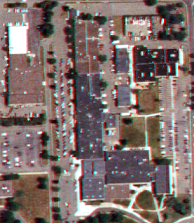
  To interpret the anaglyph images, one must use Polaroid glasses, otherwise the image will look like it's in 2D. Figures 4.6 and 4.7 shows the result of the first anaglyph image created by using the DEM as the input. In this photo, some features are displayed well, but others are not. In general, man-made features such as buildings appear to be flat with the surface. This is because the DEM was used as an input. A DEM represents the bare ground elevation of the earths surface, but the aerial imagery include other surface features. Therefore, features which rise above the ground will be misrepresented. Figure 4.6 shows the whole image, and figure 4.7 shows a zoomed in portion.
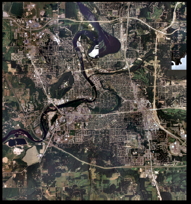
Fig 4.6: Anaglphy DEM Full
Fig 4.6: Anaglyph DEM Full

Fig 4.7: Zoomed in Anaglyph with DEM Input

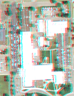
  Figure 4.8 shows the result of the second anaglyph image created by using the DSM as the input. This anaglyph image displays the features in the aerial image much better. This is because the DSM was used as the input. A DSM is used to model the surface of the first returns of objects, which is also what the aerial imagery visible shows. As a result, now buildings such as Towers South hall appear to be very tall as they are actually. Figure 4.8 shows the entire output image, and figure 4.9 shows a zoomed in portion. The difference between using the DEM as an input and the DSM as an input can really be seen in the zoomed in images.
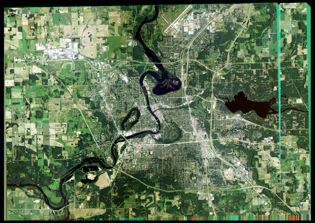
Fig 4.8: Zoomed Out DSM Anaglyph Image

Fig 4.9: Zoomed in Anaglyph Image with DSM Input
Part 3: Orthorecification
 Figure 4.10 shows Triangulation Summary window which resulted from running the triangulation in part 3. This shows the RMS error for the X, Y, and Z values of the overall GCPs. RMS error was held under 1.5 for all the GCP values.
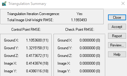
Fig 4.10: Triangulation Summary
  Figure 4.11 shows the first block of the Triangulation Summary report. The entire text document can be accessed here: Triangulation Summary Report. The report contains lots of data about the tie points and GCPs including their residual error, Image parameter values (the extent), normal weighted iterative adjustment, GCP coordinates.
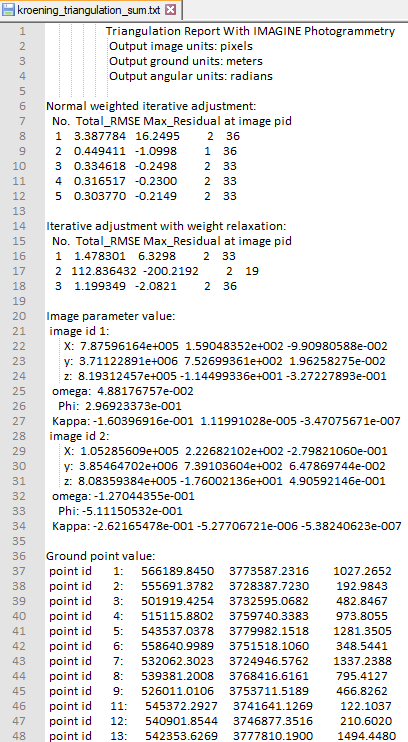
Fig 4.11: Triangulation Summary Report

 Figure 4.11 shows the result of part 3 which are the two orthorectified images. These images line up so nicely that they look like they have been mosaicked. The spatial accuracy of the two images is very high. This can be seen by looking at the boundary between the two images. The transision between the images is seamless. If there wasn't a visible line between the images, one would be unable to tell where the boundary of the images would be.
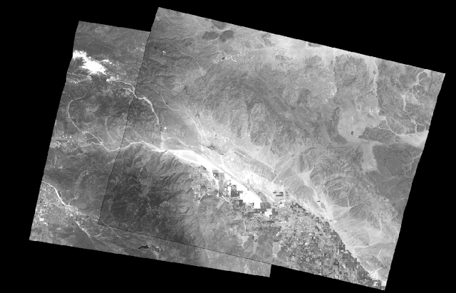
Fig 4.12: Orthorectified Images
  Figure 4.13 shown below is a video which helps to show the spatial accuracy of the orthorectified images. The video can be viewed in higher quality if expanded to full screen. In the video, the swipe tool is used to show that there is only a slight different in the overlap areas of the orthorectified images. The slight difference can be seen between 0:24 and 0:26. Between this time interval the slight difference can be seen in the river bed on the center right portion of the screen.

  Fig 4.13: Using the Swipe Tool to Show the Orthorectified Images


Sources
Agriculture Natural Resources Conservation Service, 2010.
National Agriculture Imagery Program (NAIP),  2005. United Sates Department of Agriculture
Digital Elevation Model (DEM) for Eau Claire, WI  United States Department of Agriculture
Digital elevation model (DEM) for Palm Spring, CA, Erdas Imagine, 2009.
Lidar-derived surface model (DSM) of Eau Claire and Chippewa Eau
        Claire County and Chippewa County 2017.
National Aerial Photography Program (NAPP) 2 meter images,  Erdas Imagine, 2009.
Spot satellite images, Erdas Imagine, 2009.

Monday, November 27, 2017

Lab 6: Geometric Correction

Goals and Background

  This lab introduces geometric correction. Both image to map rectification and image to image rectification will be performed on two different images. In both cases, spatial interpolation will be used with the use of GCPs from a reference image or map to change the x,y location of the pixel, and intensity interpolation will be performed by facilitating resampling to generate the relocated pixels brightness values. Image to Map rectification is detailed in part 1, and image to image rectification is detailed in part 2.


Methods

Part 1: Image to Map Rectification

  For this part, a reference map is used to rectify a distorted image. The reference map in this part is a 7.5 minute raster of the the Chicago area, and the distorted image is from the Landsat TM satellite of the Chicago area.
  Image rectification was done by first inserting the reference map and distorted image in different viewers in Erdas. Then, with the viewer with the distorted image being active, the control points button under the multispectral tab was used to bring up the Multipoint Geometric Correction window. When setting the window up, a first order polynomial was used for the GCPs, and the reference map was brought in, and all of the other defaults were accepted.
  The Multipoint Geometric Correction window contains two panes. One for the distorted image and the other for the reference map, This can be seen below in figure 3.0. The distorted image is in the left pane, and the reference map is in the right pane.
Fig 3.0: Multipoint Geometric Correction Window
  Then, 4 GCPs were created using the Create GCP button. These GCPs were placed so that they were spread out in both images. The locations of the GCPs were made sure to be located in the same location in the distorted image and in the reference map. The placement of the GCPs can be seen below in figure 3.1.
Fig 3.1: GCP Placement
  After the GCPs were added, they were moved around until the total RMS error was .4306. General guidelines for rectifying imagery is to get the RMS error under .5. Then, using the  Display Resample Image Dialog button, intesity resampling was performed on the distorted image using the nearest neighbor technique. This resampling generates a rectified image which is more spatially accurate than the original distorted image.

Part 2: Image to Image Rectification

  This part is similar to part one, but instead of using a map as the reference layer, an image will be used to rectify a distorted image. Also, The images for this part are of eastern Sierra Leone taken by the Landsat TM satellite. The distorted image in this part is more distorted than in part 1.
  To rectify the distorted image, first, the distorted image was put into a viewer in Erdas. Then, the Multipoint Geometric Correction window was brought up by clicking on the Control Points button under the mulispectral tab. This time, while setting up the window, the order of polynomials was changed to 3rd order. Doing this increases the number of GCPs needed to make the model current from 3 to 10. Also, the reference image was brought in, and all of the other default settings were accepted.
  Then, 12 GCPs were created using the Create GCP button. These GCPs were placed so that they were spread out across the images. The reason why the GCPs are spread across the image was because the distorted image needs to be pinned down to the correct location in various locations of the reference image so there is a good coverage of the whole image. Otherwise, if the GCPs are located all right next to each other, the rectified image will not be spatially accurate. The locations of the GCPs were made sure to be located in the same location in the distorted image and in the reference image. The placement of these GCPs can be seen below in figure 3.2. The distorted image is in the left pane, and the reference image is in the right pane.
Fig 3.2: GCP Placement in the Multipoint Geometric Correction
  After the GCPs were added, they were altered until the total RMS error was .1446. Then, using the Display Resample Image Dialog button, intensity resampling was performed on the distorted image using the bilinear interpolation technique. The bilinear interpolation technique is used because this image is more distorted than the image was in part one and because bilinear interpolation is more spatially accurate than nearest neighbor interpolation. This image needed the extra help in order to make the output accurate. This resampling generates a rectified image which is more spatially accurate than the original distorted image.

Results

  The results of part one is a rectified image which can be seen below in figure 3.3. This figure is a short video which utilizes the swipe tool to show how accurate the rectified image compared to the reference map. This video shows that the rectified image is very accurate as features line up almost perfectly with the map. This can be seen by looking at the Lake Michigan shoreline and also by how rivers appear to be stacked right on top of each other in the images. To increase the video quality one can watch the video in full screen mode.
Fig 3.3: Rectified Image Compared to Reference Image


  Figure 3.4 shown below is the rectified image by itself. This is shown here because the image is a little more clear here than what is shown in the video.
Fig 3.4: Rectified Chicago Image
Fig 3.4: Chicago Rectified Chicago Image
  The results of part 2 can be seen below in figure 3.5 in the short video and in figure 3.6. Just like for the results of part 1, the swipe tool is used to compare the rectified image to the reference image. Unlike in part one, there is a fair amount of distortion in this rectified image. Most of the distortion is occurring in the northwest portion of the image. This is where rivers and hills in the rectified image are not lining up with the reference image. In this image there is lower distortion in the eastern part. This is where rivers and hills appear to be stacked on top of each other in both the rectified and reference images. To increase the video quality, one can watch the video in full screen mode.
Fig 3.5: Sierra Leone Rectified Image Compared to Reference Image

    Figure 3.6 shows a clearer picture of the rectified Sierra Leone image. Overall, the rectification did a decent job of making the distorted image more spatially accurate. Perhaps with more GCPs and a lower RMS error, a more spatially accurate output could be created.
Fig 3.6: Rectified Sierra Leone Image

Sources

Earth Resources Observation and Science Center. Satellite Images
Illinois Geospatial Data Clearing House, Digital raster graphic (DRG)
United States Geological Survey. Satellite Images
Wilson, Cyril, 2017. Geometric Correction retrieved from

Sunday, November 5, 2017

Lab 5: LiDAR Remote Sensing

Goals and Background


  The goal of this lab is use and analyze LiDAR point data in the LAS file format. Below is a list of the tasks to complete in this lab.
                    1.  View the LiDAR points in Erdas
                    2.  Import the LiDAR points into ArcMap as a LAS Dataset
                    3.  Calculate statistics for the LAS Dataset in ArcMap
                    4.  Assign a coordinate system to the LAS file in ArcMap
                    5.  Examine the LAS Dataset toolbar and Properties
                    6.  Generate a DSM and Hillshade from 1st returns from the LiDAR  points
                    7.  Produce a DTM and Hillshade from the last returns of the LiDAR  points
                    8.  Derive a  LiDAR inensity image from the LiDAR points

Methods

1. View the LiDAR Points in Erdas
Fig 2.1: Prompted Dialog Box
  This was done by first opening Erdas and brining in all the files at once. This can be seen below in figure 2.0. Then a dialog box was promted which the user clicked No and unchecks Always Ask. This can be seen on the right in figure 2.1.

Fig 2.0: Bringing in LiDAR points to Erdas


2. Import the LiDAR points into ArcMap as a LAS Dataset
  First, the quarter quarter sections were brought into ArcMap to use as a reference layer for the LAS Dataset. To create the LAS Dataset, first an output folder (LAS) was specified. Then, the LAS Dataset was created by right clicking on the LAS folder and then navigating to New → LAS Dataset. Then, the LAS Dataset was given the name Eau_Claire_City.lasd. To import the LiDAR points into the data set, first, the LAS Files tab in the properties of the LAS Dataset were active. Then, the Add Files... button was used load all of the .las files using a similar process as what is shown in figure 2.0 above.

3. Calculate Statistics for the LAS Dataset in ArcMap
  To calculate the statistics for the LAS dataset, the Statistics tab in the LAS Dataset's properties was activated and the Calculate button was clicked. This is shown below with the green ovals in figure 2.2. Then, some of the statistics were looked at such as the minimun and maximum z values.
Fig 2.2: Calculating the Statistics for the LAS Dataset
Fig 2.2: Calculating the Statistics for the LAS 

4. Assign a Coordinate Systemto the LAS Dataset in ArcMap
  To assign the LAS Dataset a coordinate information, both the coordinate system had to be set in the horizontal in vertical directions. Before the coordinate system could be assigned in ArcMap, the coordinate system information had to found by looking in the metadata of the LAS Dataset in NotePad ++. The section containing the spatial reference information for both the horizontal and vertical references can be seen in figure 2.3. This block of code was found by looking at all of the the tags in the meta data file in blue text and then finding where the spatial reference tags were found. Also, it was found by browsing the file for the spatial reference data. For the horizontal spatial reference, the map projection is Lambert Conformal Conic, the datum used in the North American Datum of 1983, and the units are in survey feet. For the vertical spatial reference the datum used is the North American Vertical Datum of 1988, and the unit used is feet.

Fig 2.3: Finding the Horizontal and Vertical Spatial Reference in the Meta Data
  To assign the horizontal coordinate system, the XY Coordinate System tab was clicked on and the NAD_1983_HARN_WISCRS_EauClaire_County_Feet coordinate system was searched for and then assigned as shown below in figure 2.4. To assign the vertical coordinate system, the Z Coordinate System tab was clicked on and the NAVD88 (depth) (ftUS) coordinate system was searched for and then assigned as shown below in figure 2.5.
Fig 2.5: Assigning the Z Coordinate System

Fig 2.4: Assigning the XY Coordinate System


5. Examine the LAS Dataset Toolbar And Properties
  The LAS Dataset Toolbar was then used to examine the Lidar points without generating any new data. The main features of the toolbar  looked at include the Filters, Points, Interpolation, and Profile View features. The LAS Dataset Toolbar can be seen below in figure 2.5 along with the labeled features. Before using these, the number of classes used to display the Lidar points in the LAS Dataset was changed from 9 to 8.
  The Point dropdown allows for one to display the LiDAR points as raw points, classified according to class, or classified according to elevation. The Interpolations/Contour Lines dropdown allows one to display an interpolation of the LiDAR points with the value of the points displaying elevation, slope, or aspect. This dropdown also allows one to display contour lines generated from the LiDAR points. The Filters dropdown allows one to filter the LiDAR points by the classes Ground, Non Ground, and First Return. Lastly, the Profile View feature was looked at. This allows one to create a 2D or 3D profile of the LiDAR points including measuring and visualizing height differences between different points.
Fig 2.6: LAS Dataset Toolbar
  Also, the properties of the LAS Dataset were looked at. In the properties, the Symbology and Filter tabs were looked at. The Filter tab is another place where the LiDAR points can be reclassified similar to the Filters on the LAS Dataset toolbar. Here, the predefined settings All(Default), Ground, Non Ground, and First Return were analyzed and modified to show different returns in the LiDAR points. Figure 2.7 shows the Filter tab being used to classify the non ground LiDAR points. The Symbology tab has similar characteristics of the Interpolations / Contour Lines feature on the LAS Dataset toolbar except that it does not interpolate the points. In the Symbology tab, one can choose to display the LiDAR points with their elevation values, their aspect values, their slope values, or can display generated contour lines. Figure 2.8 shows how the Symbology tab is used to display and classify the slope values of the LiDAR points

Fig 2.8: Symbology Tab in the LAS Dataset Properties
Fig 2.7: Filter Tab in the LAS Dataset Properties


6. Generate a DSM and Hillshade from the 1st Returns of the LiDAR Points
  To do this, first the workspace of the ArcMap document was set to this lab's output folder. Then, the LAS Dataset to Raster tool was used to make the DSM surface. Before opening the tool, the LAS Dataset toolbar was used to display the LiDAR points by first return points coded by elevation. Then, the LAS Dataset to Raster tool was opened and the parameters were set. The tool input can be seen below in figure 2.8. To produce the hillshade of the DSM, the Hillshade tool was used with the input being the newly created DSM.

Fig 2.8: Generating a DSM from LiDAR

7. Produce a DTM & Hillshade from the last returns of the LiDAR points
  For this, the LAS Dataset to Raster tool was used to generate the DTM surface. The last returns in the LAS Dataset layer were displayed in the ArcMap view using the LAS Dataset toolbar. To filter these returns, the properties were changed under the filter tab so that Ground class and the Last Return return were checked. Then, the LAS Dataset to Raster tool was used and set with the parameters shown in figure 2.9 to produce the DTM. To produce the hillshade for the DTM, the Hillshade tool was used with the newly generated DTM as the input.
Fig 2.9: Generating a DTM from LiDAR

8. Derive a LiDAR Intensity Image from the LiDAR Points

 This also consisted of using the LAS Dataset to Raster tool. Because LiDAR intensity is measured by first returns, the LAS Dataset toolbar was used to display the first returns in the ArcMap view. Then, the LAS Dataset to Raster tool was used with the the proper input parameters as shown below in figure 2.10.
Fig 2.10: Generating the Intensity Image from LiDAR

Results

  Figure 2.11 depicts a map of the DSM generated from task 6. This DSM represents the first returns surface collected by the LiDAR sensor. The DSM values over the water on Halfmoon Lake and parts of the Chippewa River can be ignored because in these areas the LiDAR values were inaccurate due to a low number of points being collected on water surfaces.
Fig 2.11: DSM Map
Fig 2.11: DSM Map
  Shown below in figure 2.12 is a map of the hillshade generated from the DSM above. This hillshade was created as a part of task 6. Because this hillshade is based off of first returns, it is messy. The hillshade is mostly generated to help explain the DSM above through shading and relief. It shows relief values from low to high. The legend for the hillshade values aren't shown because they don't carry any units or analytical meaning. The hillshade is produced just to help visualize the DSM above. Usually, the hillshade can be overlaid with a DSM, but in this case, the result looked unorganized and messy, so they were split apart.
Fig 2.12: Hillshade Map Generated from the DSM
  Figure 2.13 shows the DTM of Eau Claire overlaid with the hillshade generated by it. These rasters were created in task 7.To help the hillshade visualize the DTM, the hillshade layer is displayed at 50% transparency. This DTM shows the last returns and the ground returns of the LiDAR points. This DTM could have many potential uses including modeling the volume of hills or sand piles, or flood modeling.
Fig 2.13: DTM Overaid with a Hillshade Map
  Lastly, figure 2.14 displays the LiDAR intensity map created from the LiDAR intensity image generated in task 8. The LiDAR intensity image as the look of a black and white aerial photo because like the DSM, the intensity values are based of of the first returns. This map can be used to identify features based on intensity values. For example, water features have very low intensity values and be identified by their black color.
Figure 2.14: LiDAR Intensity Map


Sources

Eau Claire County, 2013. LiDAR Point Cloud and Tile Index
Price, Margaret, 2014, Eau Claire County Shapefile, Mastering ArcGIS 6th Edition Data
Wilson, Cyril, 2017 LiDAR Remote Sensing retrieved from https://drive.google.com/file/d/1PbYbNCPJD8ksfgvzUZ6vUsx04QX852R8/view?usp=sharing